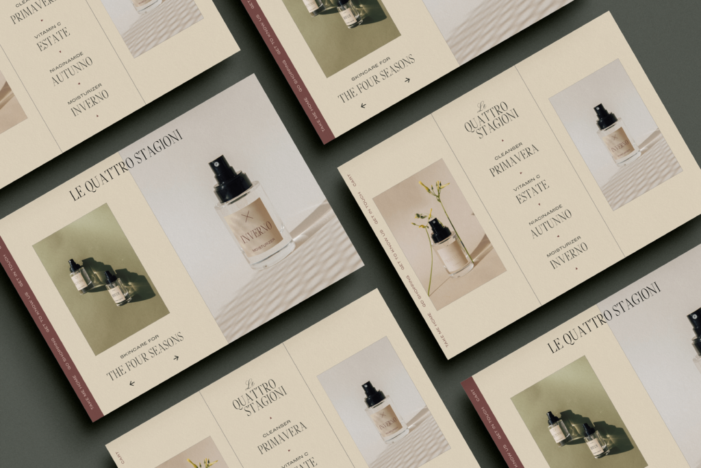
Your e-commerce store’s sole purpose is to promote and sell your business’ products. So, why wouldn’t you take every step to make sure it’s built for success? Bringing your eager-to-buy audience to your website is step one, but once they’re there, your site has to have what it takes to convert them into customers. Luckily, Shopify has all the tools and functionality you need to optimize your site to be conversion city!
I’ll tell you exactly how to improve your e-commerce store’s conversion rates with Shopify in this post.
- Check your site speed
- Make a great first impression
- Optimize your store for all devices
- Clearly state why your products are great
- Use professional brand photos
- Ship your products for free
- Create a clear path to purchase
- Make checkout a breeze
- Offer email incentives
- Heat up a warm audience with ads
- Proudly share customer reviews
- Work with a Shopify design pro
Check Your Site Speed
Once you’ve caught a potential customer’s attention, and they’ve made their way to your site, you don’t want to lose them due to a few seconds’ wait time. But, the reality is, you’ll lose a good majority of website visitors (82% of them!) if it takes more than two to three seconds for it to load.
Now that I’ve got you nervous about how quickly your page is loading, take a deep breath: If your site is slow to load, you can fix it. Start by compressing your photos, cleaning up any unnecessary code on your site’s backend, deleting unnecessary apps and app code, and embedding your videos. Those steps alone can make a big difference in your site speed.
Make a Great First Impression
Ever heard the quote, “You never get a second chance to make a first impression?” Well, it’s definitely the case when it comes to your e-commerce store site. If you want to turn website visitors into happy customers, your first impression needs to be on point. It starts with your top hero section (the area that immediately appears under your logo and menu.)
Your top hero section should tell visitors exactly what your e-commerce store sells. The section should also display a high-quality brand photo showcasing your product(s), with a clear call to action (CTA) button that takes visitors to the next step – browsing your products.

Optimize Your E-Commerce Store Site for All Devices
Remember when mobile phones were pretty much just used for calls and texts? Those days are long gone. Today, people manage every area of their lives on their phones. And yes, it’s where they do their shopping! In fact, more than half of internet users use their phones to shop online. So, of course, you’d want to make sure potential customers can shop your site easily on their mobile devices, wouldn’t you??
Shopify has tons of responsive themes that are optimized for every possible device. To make sure your e-commerce store can be easily viewed and used on a mobile device, consider the following steps:
- Make your store’s buttons and links easy to see and tap.
- Design your navigation menu to be as simple as possible.
- Don’t overload your site with text, and make sure the text you have is large enough to read.
- Place a fixed CTA button (one that mobile users can always see).
- Make sure your navigation bar can always be seen, too.
Clearly State Why Your Products Are Great
You might have a beautiful website and a perfectly built-out e-commerce store, but if a visitor can’t quickly see exactly what your products can do for them, they might lose interest (and fast).
The solution? Be crystal clear about your products’ benefits in your copy. Don’t just describe your products or their features. Tell your website visitors about the benefits they’ll experience if they buy your products.
Use Professional Brand Photos on Your E-Commerce Site
I know, your iPhone probably takes excellent photos. Maybe you’ve been able to avoid investing in professional brand photos thus far. But, your e-commerce store site isn’t the place to use anything but high-quality images of your products.
From a website visitor’s perspective, the quality of your product photos translates to the quality of your products, period. Don’t let lackluster imagery be what deters a website visitor from converting to a customer!
Ship Your Products for Free
Have you heard of “The Amazon Effect?” It’s the impact Amazon has had on customers’ expectations for their online shopping experience: primarily, the fact that they want products shipped fast and shipped free. These days, as many as 55% of customers abandon their shopping carts when they discover unexpected shipping costs. People don’t want to pay for shipping.
How do you avoid losing half of your e-commerce customers to shipping costs? Offer them free shipping by adding the cost to your products. People would rather see “Free Shipping” than a separate shipping cost at checkout.
Create a Clear Path to Purchase from Your E-Commerce Store
Once a website visitor sees something they want on your site, it’s crucial that they can quickly and intuitively make a purchase. Have you ever been on a site and struggled to figure out where to get where you want to go? Yea, that’s what we want to avoid.
Create a clear and confusion-free path to purchase by:
- Making product images and their text clickable.
- Adding a search bar and product filtering capability, so people can find things fast.
- Using various payment methods so everyone can use what they’re comfortable with. I recommend PayPal, Apple Pay, Amazon Pay, Google Pay, American Express, Stripe, Square, Visa, Masterpass, and 2Checkout.

Make Checkout a Breeze
A customer at your e-commerce site’s checkout page is as close to a conversion as it gets. This point in their buying journey is important!
Your Shopify checkout page should be simple: Gather the basic info needed for the transaction, mention that free shipping you’re offering, and collect their payment information. If you’d like, you can add some urgency to their checkout with a timer. The key to turning visitors into customers at this stage is to make things easy peasy for them.
Want to make checkout even easier? Utilize Shopify’s Shop Pay option, which provides payment plans and speeds up the checkout process by 4x.
Offer Email Incentives
Email marketing can be an online business’ best friend. With an ROI of $39 for every $1 spent, email is a proven tool for building your audience and business. Email can play a valuable role in converting your e-commerce store’s visitors to customers.
Offering website visitors a discount on their first purchase, in exchange for their email address, helps you accomplish two goals. First, everyone loves a deal. If your potential customer was 90% sold on buying your product, getting a discount can be what seals the deal. Second, it helps you build your email list.
Your business’ email list is a great source of future customers or repeat customers. As you grow your list, be sure to nurture it with lots of value. You can offer them discounts or early bird access to new products or promotions. You can also give them helpful content related to your business.
Heat Up a Warm Audience With Ads
Your warm audience has already engaged with your business in some way. These are prime people to share ads with about promotions, sales, or discounts you might be running on your e-commerce store site.
People who are on your email list, have visited your website, or follow you on social media have (at some point) decided your products could be something they’d like to buy. Pushing ads their way might just be the nudge they need to move from someone interested to a converted customer!
Proudly Share Customer Reviews
People like to know they’re buying something that’s as good as it seems. Product reviews are often the social proof buyers need to make a purchase decision, so it’s vital that you display positive ones on your Shopify store!
Just how much of an impact do product reviews have on conversions? Consider these stats:
- 95% of online shoppers read product reviews before making a purchase.
- The purchase likelihood for a product with five reviews is 270% more than the purchase likelihood of a product with no reviews. (That’s huge!)
- Displaying reviews for a lower-priced product can improve a conversion rate by 190%; Displaying reviews for a higher-priced product can improve your conversion rate by 380%.
It’s safe to say that product reviews are your friend when it comes to conversions!
Work With a Shopify Design Pro
Ready to create a gorgeous Shopify website for your retail business? Start with a conversion-conscious branding strategy and design! Contact me to find out how my Branding & Web Design services can help you launch your dream business!
